Behind the Scenes with Locavino

menu design template for Locavino wine cafe
Even before it opened in the summer of 2019, pre-pandemic (remember then?), Locavino was primed to become downtown Silver Spring’s answer to “Cheers,” a warm, inviting, relatable place where you are welcomed as a friend whether “everybody knows your name” or you’re just passing through town.
Indeed, warm, inviting and relatable were the key words when I began discussing the wine cafe’s brand personality with owners Jarrod Jabre and Justin Wallace, both beloved members of the Silver Spring community and veterans of the local restaurant and wine scene. At that point, the name Locavino — a play on “locavore” and the Italian word for wine — had not yet been chosen. Still, we were able to select fonts, colors, and formulate a visual look based on feelings Justin and Jarrod wanted their establishment to evoke. Here is a note from the design brief (more on why design briefs matter here):
“...this wine cellar is not here to pass judgment on customers, but rather share the passion its employees have for the craftsmanship behind great wines. The staff here are intelligent and knowledgeable, but put an emphasis on engaging customers through stories rather than stats.”
The owners wanted to create a community-oriented restaurant where the staff could build relationships with customers, engage with the community through events and local issues, and where neighbors could share intimate space and conversation. I wanted to be sure that the brand reflected Jarrod’s and Justin’s humor and quirkiness, contributing a playful, witty, homegrown (also focus words in the design brief) feel that would drive people to want to engage with the space.

Locavino interior design using brand look & feel
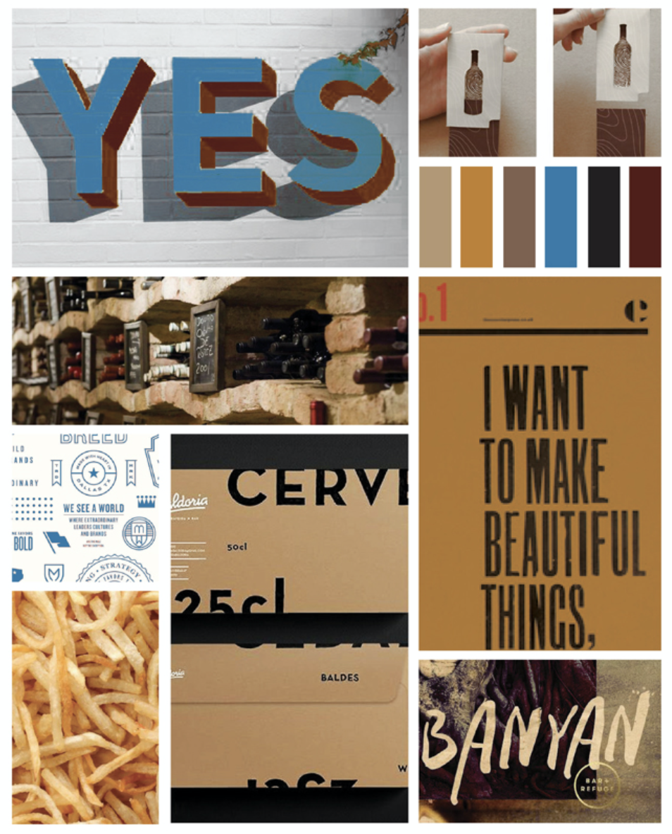
mood board for Locavino branding design
In the Mood
As with all clients, I created a series of mood boards (more on these in the near future!) to help focus the feeling of the branding. Mood boards include images, color palettes, fonts … it’s something to look at and say, “this is what we want to feel.” Sometimes, the mood board only helps to inform the website, logo and published materials, but in the case of Locavino, Jarrod and Justin used it to help them choose the paint and materials for the restaurant, allowing the branding to carry over into the design of the space. Everything coordinates for a consistent customer experience. Making decisions about the visual brand at the beginning helped them move through other parts of setting up their business without having to start from square one at every step. Without having that branding in place to give a clear direction of how the aesthetic will represent the restaurant and the owners, their process of designing the interior for the space would have been a heavier lift without the branding in place. Having a clear direction informed all those nitty gritty choices, like what kind of wood to use for displays, and made the process more streamlined and efficient.

exterior shot of Locavino wine cafe featuring wine bottle logo design
Looking at the Logo
Our logo-planning discussions began very open-endedly. Justin and Jarrod didn’t have any preconceptions about what the logo should look like, but the big thing we talked about was making sure the design felt local and wouldn’t be confused with any kind of entity that’s big and corporate.
I came up with the wine bottle diagram to show how they are into understanding and sharing the different qualities of wine and beer — where it comes from, how it’s made — in an educational way, without expecting their customers to come in already knowing everything about wine. The intention of the logo is to illustrate that the team at Locavino is here to break down wine (and beer) for their community in an inclusive and non-snooty way.

business card design featuring Locavino brand look & feel
Flexibility and Adaptability
Because there was flexibility built into the Locavino logo and branding — for instance it doesn’t depict a couple toasting with wine glasses — the core branding has been able to stay the same even as dine-in eating and functioning as a community gathering space has been interrupted due to COVID-19. With no adjustments or additions to their visual brand, they have been able to continue to serve their core brand values of being warm, friendly and inviting, serving the community through delivery and carryout services, wine delivery, and Zoom tastings without having to make any changes to their brand visuals. (More here on why flexible logos are so important.)
A Note from the Client
Christy was able to effortlessly guide us through not only our logo, but our brand development, to make sure they coincide perfectly. Our logo embodies our commitment to showcase parts and members of our community while also being your favorite neighborhood wine cafe! We always believe that the product should speak for itself and our logo does just that!
Justin Wallace, co-owner, Locavino
CHANGEMAKER OF THE MONTH
For this month’s change maker of the month, I’m spotlighting and donating to Fair Fight, an organization whose mission is to promote fair elections in Georgia and around the country, encourage voter participation in elections, and educate voters about elections and their voting rights. This was a good chance for me to celebrate the work this organization has done to empower voters in the 2020 presidental election and beyond!