Five Logos I Love

I want you to try something: Next time you’re out in a reasonably populated area, set a timer for five minutes and count how many logos you spot. Look at storefronts, clothing, bags, buses and taxis going by… we are awash with logos.
A logo can be instant recognition. Think the Nike swoosh, the Apple apple, McDonalds’ golden arches, Ralph Lauren’s polo player… or typographic logos like Coca Cola, FedEx, the New Yorker… fonts you’d recognize at a glance. A logo can also tell a story – the Amazon arrow pointing from A to Z, the Toblerone bear climbing the Matterhorn…
A logo is often the first impression someone has of your company. Maybe it’s the designer in me, but a logo can make or break whether I want to go into a shop or learn more about a brand. Here are five logos that caught my eye and made me want to get to know a company.
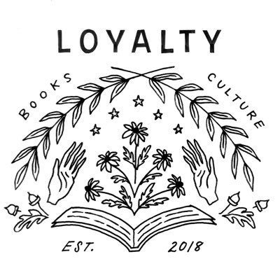
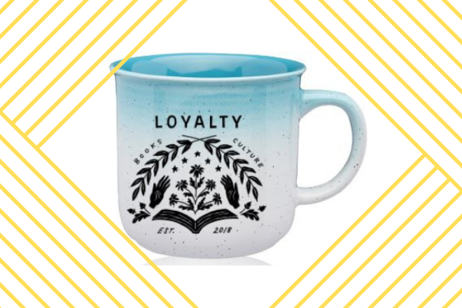
Loyalty Books
Designed by: Karen DeMaio Weber
I love how this logo for a local bookstore here in Silver Spring (and DC, too) feels like how I want a bookstore to feel. The black and white design feels classic, like something you may find stamped in an old book. The drawings evoke curiosity and imagination while still being organized in a symmetrical, orderly fashion. It’s just so dang inviting! The typography is hand-drawn and human and imperfect. It both catches and keeps your attention, much like a great book cover. And it doesn’t hurt that the Loyalty logo looks awesome on a tote bag while carrying home all your new book purchases!


Public Theater
Designed by: Paula Scher / Pentagram
This is one of my favorite logos of all time. If you’ve seen me present about design, you’ve likely seen this logo. It’s a prime example of how a typographic logo can work. Many people are concerned about the simplicity of a typographic logo being “interesting enough.” In this case, the unique typeface and unequal letter widths gives the logo an edgy feel that stands out from other New York theaters. The type feels bold and risky. And the simplicity gives the design flexibility work in any number of layouts that need to be created for production promotions. The typographic logo is great at playing second fiddle to other elements of a poster design, creating more opportunity for experimentation and fun.
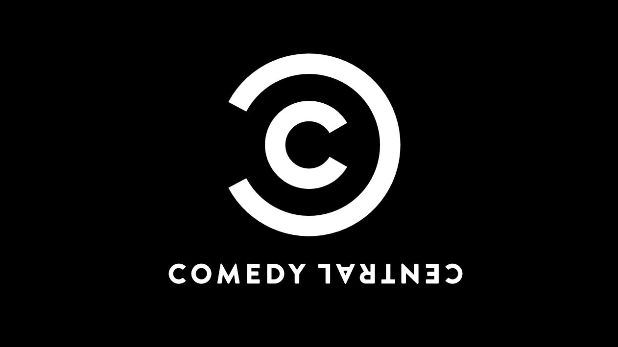
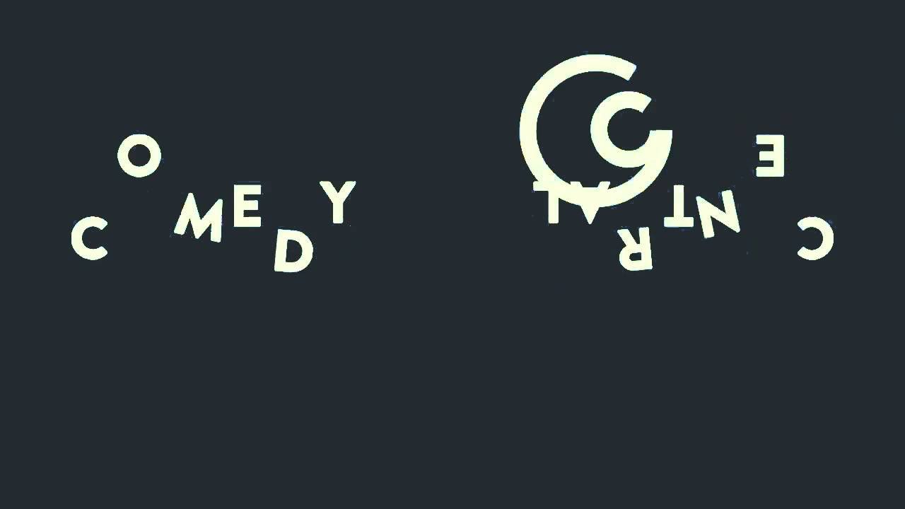
Comedy Central
Designed by: thelab
I’ve really loved this logo since it debuted in 2011. I like how the starkness feels like a spoof or parody of a corporate brand. The part of the text that’s upside down lets you in on the joke. And it’s a great example of how these days, a logo isn’t just how it appears on paper. Motion is often a crucial element and the way this one spins and moves is humorous and fun. It was clearly designed for the context that it lives in – on tv and digital media. The simplicity has helped the logo hold up over time. They’ve made some adjustments in 2018 (making the text more straightforward but less fun) but the logo mark has stayed the same.
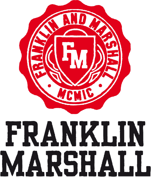

Franklin & Marshall
Designer: Di Caprio Davide Valentino
This one is weird, and you know I love weird! I earned my B.A. at Franklin & Marshall College in Lancaster, PA. But this logo is not for Franklin & Marshall College in Lancaster, PA. Is it the logo for an Italian clothing brand created in 2000 based on the ‘idea’ of my college because the designers saw one of our shirts and found it compelling. The whole brand is based on this kind of idealized American college experience and it makes me chuckle to think of how it compares (or rather, doesn’t compare) to my actual experience – let’s just say I didn’t spend a lot of time tossing a football on the quad or reading studiously among dark wood antique furniture. I also love how these brands co-exist: The clothing brand now has a formal deal with the college to use their name. It’s an interesting example of how storytelling and fantasy play out in fashion in a way that is very personal to me!


American Visionary Art Museum
Designer: unknown
This logo for the American Visionary Art Museum in Baltimore, MD stands out to me because it really makes it clear how the AVAM is going to be different from any other museum you’ve experienced. This museum celebrates the artwork of self-taught artists, often called ‘outsider artists,’ and the playful style of the logo very clearly communicates the unconventional nature of this institution. I’m not usually a fan of the block-style lettering because it reminds me of middle school, but in this context it feels authentic, accessible, and appealing to all audiences. The eye icon ties in with the “O Say Can You See” signage on one of the museum buildings in honor of the national anthem that was written at nearby Fort McHenry. There is a very clear sense of purpose and place in this logo that is powerful and memorable.
CHANGE MAKER OF THE MONTH
This month, I’m spotlighting and supporting the GoFundMe to support Alice Wong’s home care. Alice is an impactful author and advocate in the disability community. This community support will help Alice be able to stay in the comfort of her own home rather than an inpatient institution.