Creative Fuel: A Designer’s Guide to Inspiring Films (Part 1)

When the summer heat hits full blast and surprise thunderstorms roll in like clockwork, hunkering down with a movie feels like the escape I need. I’ll take the AC, a cold drink, and a good movie any day. But even during these slow, stormy afternoons, I still want to keep my creative spark going. That’s when I reach for the films (and shows) that feed my artistic side.
This list rounds up some of my favorites—think documentaries on design icons, plus visually stunning movies that make you want to hit pause just to soak in the details. And if you’re the type of viewer who loves diving into commentary tracks and behind-the-scenes extras, you’re in good company.
To keep things manageable, I’m splitting this list into two parts. Enjoy part one, and stay tuned for the next batch of inspiring films. Happy viewing!
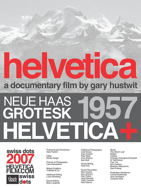
Helvetica
What do Panasonic, Oral B, JC Penney, Crate & Barrel, and Lufthansa Airlines have in common? They all use some iteration of the Helvetica font in the logo. The 2007 documentary, aptly titled “Helvetica,” is the first of filmmaker Gary Hustwick’s trio of design-centric documentaries, which also includes “Objectified” and “Urbanized.” My first design mentor actually told me that when he showed this film to his parents, he felt like they were finally able to understand his job – a quibble we creatives often find ourselves in. As we’ve previously discussed, determining a fitting typeface for your brand takes some consideration. Ths documentary delves into the history of Helvetica, how it came out of the Modernist movement, why it’s so widely used, and why some designers just don’t dig it. Can’t make everyone happy, right? So how do I feel about Helvetica (the typeface, not the film?) It’s reliable, clean, and easy to read. I don’t usually recommend it for a primary brand font because it doesn’t have as much standout personality, but it works well in a supporting role.
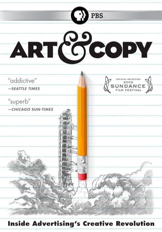
Art & Copy
This film really delves into the advertising industry and takes a look at the inspiration behind some of the most recognizable campaigns like “Just Do It” and “I (Heart) NY.” Although I don’t work specifically in advertising, branding and advertising are basically siblings. Or maybe they’re married. Or maybe they’re married siblings in one of those weird places where people do things like that.
Milton Glaser: To Inform and Delight
Speaking of the “I (Heart) NY” logo, it was designed by illustrious artist and designer Milton Glaser, who is the subject of this 2008 documentary. Even if you’ve never heard of Mr. Glaser, you’ve probably seen at least one of his designs: He created the 1967 poster of Bob Dylan with brightly colored hair, the poster for the final season of Mad Men, and designed posters for various schools, museums, and events, as well as book covers. As a founder of New York Magazine, Glaser designed the distinctive logo for that as well. “To Inform and Delight” is a short (73 minutes), charming documentary that chronicles Glaser’s life and work.


The Grand Budapest Hotel
This is not a movie about design, but rather a movie with amazing design. All of Wes Anderson’s films are visually fascinating, with great attention to detail but from a design perspective, The Grand Budapest Hotel is top of the pops. Look carefully at some of the props like the currency, passports, telegrams, and hotel signage to see the meticulous work of graphic designer Annie Atkins. An article about her work on the project appears here.